Analysis of Coffee Preference

Author

Kim, Janine, Sera & Akansha

Published

July 9, 2025

Comparing personal preferences and bitterness for CoffeeC

import pandas as pd
df = pd.read_csv("../../data_sources/coffee_survey.csv")
import matplotlib.pyplot as plt
import seaborn as sns
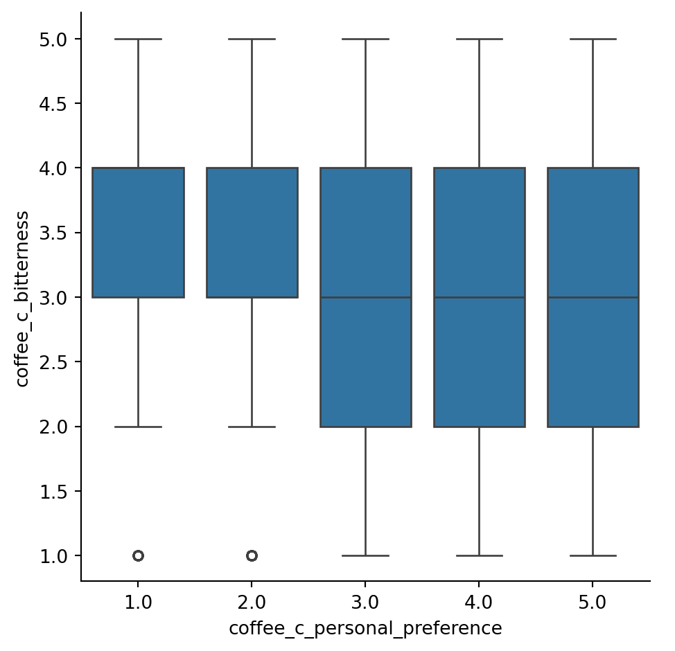
sns.catplot (data = df, 
             x = "coffee_c_personal_preference",
             y = "coffee_c_bitterness",
             kind = "box")

Distribution of Age

sns.displot(data = df, y = "age")

Distribution of Favourite coffee

sns.displot(data = df,
            y = "favourite",
            binwidth = 1)

Favourite coffee based on gender

sns.displot(data = df, x = "gender", y = "favourite")
plt.xticks(rotation=45, ha='right')
([0, 1, 2, 3, 4],
 [Text(0, 0, 'Other (please specify)'),
  Text(1, 0, 'Female'),
  Text(2, 0, 'Male'),
  Text(3, 0, 'Non-binary'),
  Text(4, 0, 'Prefer not to say')])

Preferred Coffee Style

names = ['Pourover', 'Latte','Drip coffee', 'Cappuccino', 'Espresso','Cortado','Americano', 'Iced coffee', 'Mocha','Cold brew','Other', 'Blended drinks']
size = [1026, 654, 415, 330, 309, 295, 238, 147, 116, 108, 105, 45]
# Create a circle at the center of the plot
my_circle = plt.Circle( (0,0), 0.7, color='white')
# Give color names
plt.pie(size, labels=names, colors=['red','green','blue','skyblue'])
p = plt.gcf()
p.gca().add_artist(my_circle)
 
# Show the graph
plt.show()