Show code
import seaborn as sns
import matplotlib.pyplot as plt
import numpy as np
import pandas as pdWe are investigating the relationship between coffee preferences and age, specifically preferred coffee style, amount consumed, coffee expertise and overall favourite coffee type from the tasing. The dataset we are using comes from a Great American Coffee Taste Test, during which thousands of people simultaneously blind-tasted the same four coffees.
import seaborn as sns
import matplotlib.pyplot as plt
import numpy as np
import pandas as pdimport seaborn as sns
import matplotlib.pyplot as plt
import numpy as np
import pandas as pd
df = pd.read_csv("../../data_sources/coffee_survey.csv")
sns.catplot(data = df, x = "coffee_a_bitterness", y = "age", kind = "bar")
df = df[df["coffee_a_bitterness"] != "Missing"]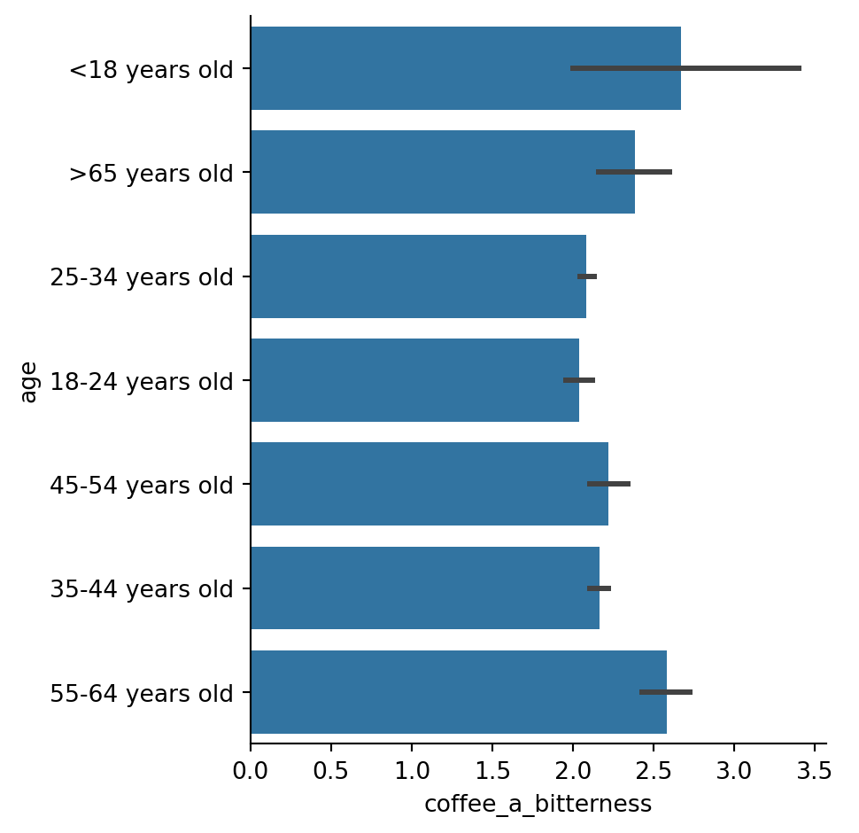
Pie chart, distribution of coffee styles
style_counts = df["style"].value_counts()

plt.pie(style_counts, labels=style_counts.index, autopct="%1.1f%%", startangle=140)

plt.axis("equal")

plt.title("Distribution of Coffee Styles")

plt.show()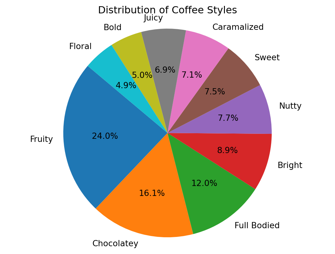
import seaborn as sns
import matplotlib.pyplot as plt
import numpy as np
import pandas as pd
import plotly.express as px


custom_order = ['<18 years old', '18-24 years old', '25-34 years old',
              '35-44 years old', '45-54 years old', '55-64 years old',
              '>65 years old']
df["age"] = pd.Categorical(df["age"], categories=custom_order, ordered=True)

custom_order = ['Less than 1', '1', '2', '3', '4', 'More than 4']
df["cups"] = pd.Categorical(df["cups"], categories=custom_order, ordered=True)

fig = sns.displot(data = df,
            x = "age",
            hue_order = ['<18 years old', '18-24 years old', '25-34 years old',
                         '35-44 years old', '45-54 years old', '55-64 years old',
                         '>65 years old'],
            binwidth = 1,
            hue = "age",
            col = "cups")


axs = fig.axes[0]

for ax in axs:
    ax.tick_params(axis="x", rotation=30)


figu = px.bar(df, x="age", y="cups", color="cups", barmode="group",
                          category_orders={"age":['<18 years old', '18-24 years old', '25-34 years old',
                          '35-44 years old', '45-54 years old', '55-64 years old',
                          '>65 years old'],"cups":['Less than 1', '1', '2', '3', '4', 'More than 4']},
             pattern_shape="cups", pattern_shape_sequence=[".", "x", "+", "-", "/","|"])
figu.show()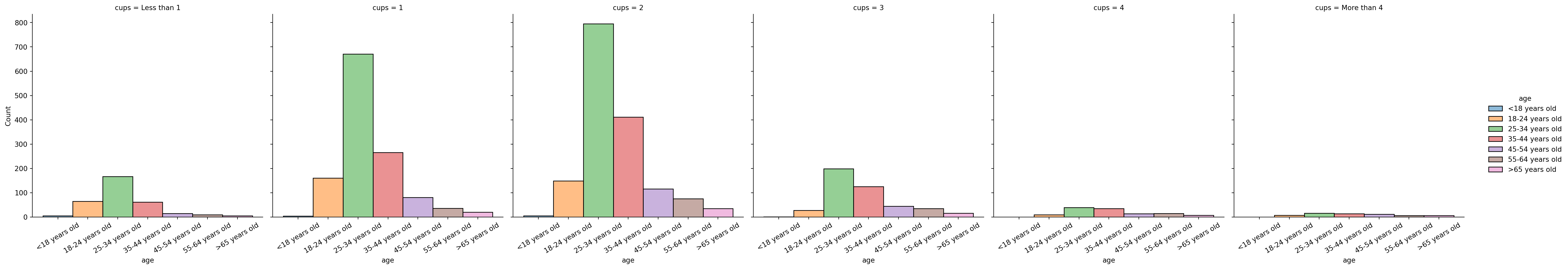
import seaborn as sns
import matplotlib.pyplot as plt
import numpy as np
import pandas as pd
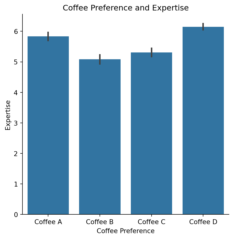
custom_order = ['Coffee A', 'Coffee B', 'Coffee C', 'Coffee D']
df["prefer_overall"] = pd.Categorical(df["prefer_overall"], categories = custom_order, ordered = True)
sns.catplot(data = df, x = "prefer_overall", y = "expertise", kind = "bar")
plt.xlabel("Coffee Preference")
plt.ylabel("Expertise")
plt.title("Coffee Preference and Expertise")
plt.show()