Set up code
import matplotlib.pyplot as plt
import pandas as pd
import plotly.express as px
import seaborn as sns

df_raw = pd.read_csv("../../data_sources/Players2024.csv")import matplotlib.pyplot as plt
import pandas as pd
import plotly.express as px
import seaborn as sns
df_raw = pd.read_csv("../../data_sources/Players2024.csv")We’ll begin just by taking a glimpse at the dataset:
df_raw.head(10)| name | birth_date | height_cm | positions | nationality | age | club | |
|---|---|---|---|---|---|---|---|
| 0 | James Milner | 1986-01-04 | 175.0 | Midfield | England | 38 | Brighton and Hove Albion Football Club |
| 1 | Anastasios Tsokanis | 1991-05-02 | 176.0 | Midfield | Greece | 33 | Volou Neos Podosferikos Syllogos |
| 2 | Jonas Hofmann | 1992-07-14 | 176.0 | Midfield | Germany | 32 | Bayer 04 Leverkusen Fußball |
| 3 | Pepe Reina | 1982-08-31 | 188.0 | Goalkeeper | Spain | 42 | Calcio Como |
| 4 | Lionel Carole | 1991-04-12 | 180.0 | Defender | France | 33 | Kayserispor Kulübü |
| 5 | Ludovic Butelle | 1983-04-03 | 188.0 | Goalkeeper | France | 41 | Stade de Reims |
| 6 | Daley Blind | 1990-03-09 | 180.0 | Defender | Netherlands | 34 | Girona Fútbol Club S. A. D. |
| 7 | Craig Gordon | 1982-12-31 | 193.0 | Goalkeeper | Scotland | 41 | Heart of Midlothian Football Club |
| 8 | Dimitrios Sotiriou | 1987-09-13 | 185.0 | Goalkeeper | Greece | 37 | Omilos Filathlon Irakliou FC |
| 9 | Alessio Cragno | 1994-06-28 | 184.0 | Goalkeeper | Italy | 30 | Associazione Calcio Monza |
The data had a few issues, as the following plot shows:
sns.catplot(df_raw, x = "positions", y = "height_cm")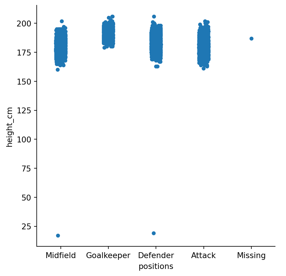
It looks like some of the players’ positions and heights were recorded incorrectly. To clean, let’s remove the “Missing” positions and ensure that heights are reasonable:
df = df_raw.copy()

# Remove missing position
df = df[df["positions"] != "Missing"]

# Ensure reasonable heights
df = df[df["height_cm"] > 100]
To confirm, let’s plot the outliers in a different colour
# Identify outliers
outliers = pd.concat([df_raw,df]).drop_duplicates(keep = False)

sns.catplot(df, x = "positions", y = "height_cm")
sns.stripplot(outliers, x = "positions", y = "height_cm", color = "r")
After cleaning the data we can now analyse the players’ heights to see if there’s differences between positions. A box plot can show the distribution of heights:
sns.catplot(data = df, x = "positions", y = "height_cm", kind = "box", order = ["Goalkeeper", "Defender", "Midfield", "Attack"])
plt.xlabel("Position")
plt.ylabel("Height (cm)")
plt.savefig("tb.png")
plt.show()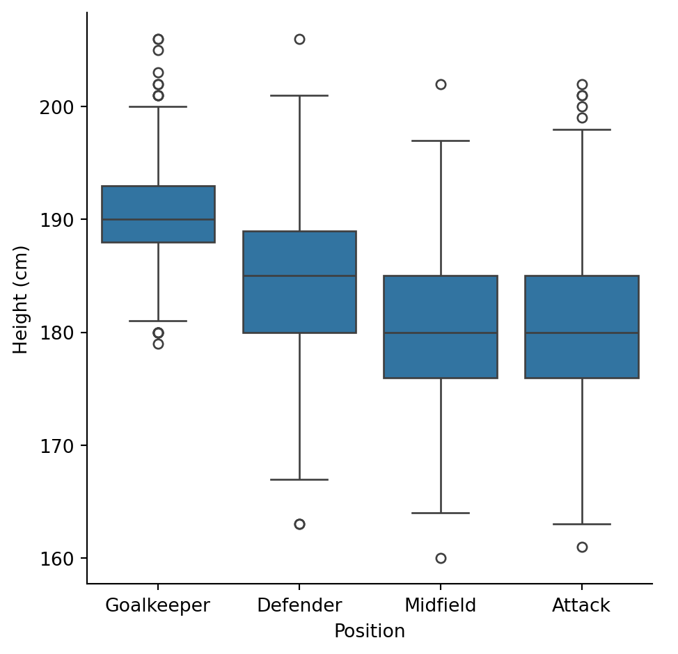
It looks like goalkeepers are taller than the rest!
Let’s through the age variable into the mix, to see if players’ heights allow them to compete longer.
px.scatter(data_frame = df, x = "age", y = "height_cm", color = "positions",
           facet_col = "positions", facet_col_wrap = 2, hover_name = "name",
           hover_data = "nationality", labels = {"height_cm": "Height (cm)",
                                                 "positions": "Position"})
It doesn’t look like there’s a relationship between heights and ages, but clearly it affects their position!
We haven’t looked at the nationality column yet. Let’s draw up a map using plotly to see where the players come from.
# Change country names to match plotly reference
df["nationality"] = df["nationality"].replace(["England", "Türkiye", "Cote d'Ivoire",
                                               "Northern Ireland", "Wales"],
                                               ["United Kingdom", "Turkey", "Ivory Coast",
                                                "United Kingdom", "United Kingdom"])

# Make the count
countries = df.value_counts("nationality")

# Make the plot
px.choropleth(locations = countries.index, locationmode = "country names", color = countries,
              labels = {"locations": "Country", "color": "# of players"})
Looks like most players are from Europe. Pan and zoom to see the finer details.