Set up code
library(ggplot2)
library(dplyr)
library(plotly)
library(knitr)

players_raw <- read.csv("../../data_sources/Players2024.csv")library(ggplot2)
library(dplyr)
library(plotly)
library(knitr)
players_raw <- read.csv("../../data_sources/Players2024.csv")We’ll begin just by taking a glimpse at the dataset:
kable(head(players_raw))| name | birth_date | height_cm | positions | nationality | age | club |
|---|---|---|---|---|---|---|
| James Milner | 1986-01-04 | 175 | Midfield | England | 38 | Brighton and Hove Albion Football Club |
| Anastasios Tsokanis | 1991-05-02 | 176 | Midfield | Greece | 33 | Volou Neos Podosferikos Syllogos |
| Jonas Hofmann | 1992-07-14 | 176 | Midfield | Germany | 32 | Bayer 04 Leverkusen Fußball |
| Pepe Reina | 1982-08-31 | 188 | Goalkeeper | Spain | 42 | Calcio Como |
| Lionel Carole | 1991-04-12 | 180 | Defender | France | 33 | Kayserispor Kulübü |
| Ludovic Butelle | 1983-04-03 | 188 | Goalkeeper | France | 41 | Stade de Reims |
The data has a few issues, as the following plot shows:
ggplot(players_raw, aes(x = positions, y = height_cm)) +
geom_boxplot() 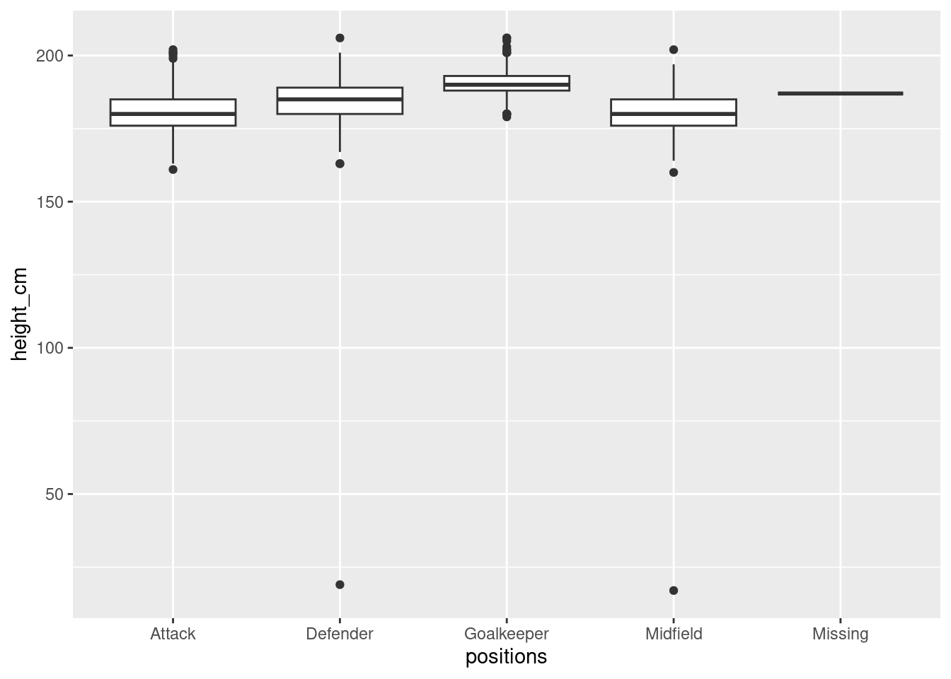
#sns.catplot(df_raw, x = "positions", y = "height_cm")It looks like some of the players’ positions and heights were recorded incorrectly. To clean, let’s remove the “Missing” positions and ensure that heights are reasonable:
# Remove missing position and ensure reasonable heights
players <- players_raw %>% filter(positions != "Missing", height_cm > 100)
To confirm, let’s plot the outliers in a different colour
# Identify outliers
outliers <- anti_join(players_raw, players)

# Plot
ggplot(players, aes(x = positions, y = height_cm)) +
  geom_boxplot() +
  geom_point(data = outliers, colour = "red")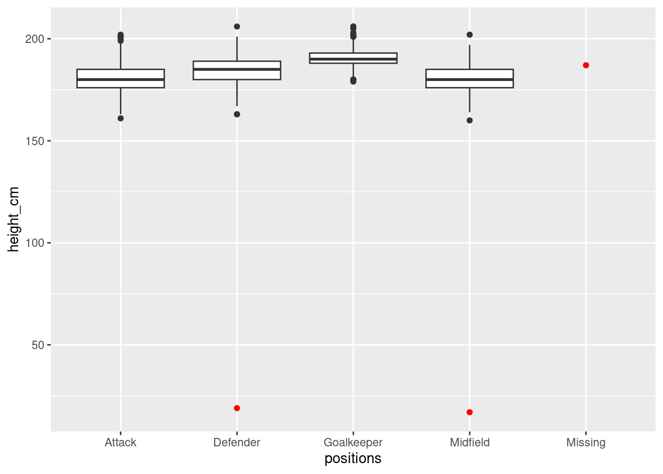
After cleaning the data we can now analyse the players’ heights to see if there’s differences between positions. Let’s make the boxplot without the outliers
ggplot(players, aes(x = positions, y = height_cm)) +
  geom_boxplot() +
labs(x = "Position", y = "Height (cm)") 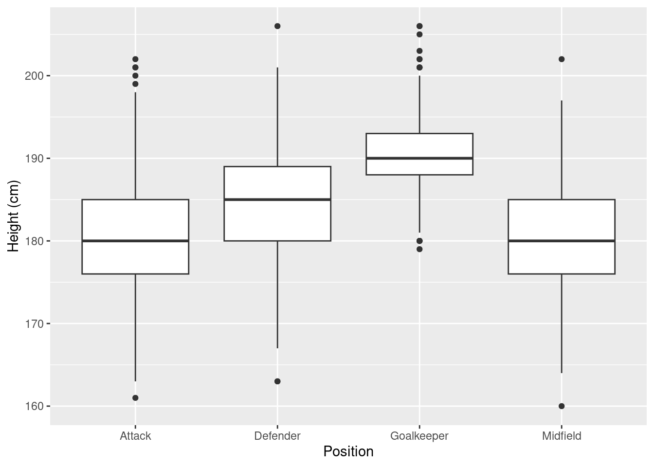
ggsave("tb.png")It looks like goalkeepers are taller than the rest!
Let’s through the age variable into the mix, to see if players’ heights allow them to compete longer.
p <- ggplot(players, aes(x = age, y = height_cm, colour = positions, label = name, label2 = nationality)) +
  geom_point() +
  facet_wrap(vars(positions)) +
  labs(x = "Age", colour = "Position", y = "Height (cm)")

ggplotly(p)
It doesn’t look like there’s a relationship between heights and ages, but clearly it affects their position!
We haven’t looked at the nationality column yet. Let’s draw up a map using plotly to see where the players come from.
# Change country names to match plotly reference
players <- players %>%
  mutate(nationality = case_match(nationality,
                                  "England" ~ "United Kingdom",
                                  "Türkiye" ~ "Turkey",
                                  "Cote d'Ivoire" ~ "Ivory Coast",
                                  "Northern Ireland" ~ "United Kingdom",
                                  "Wales" ~ "United Kingdom",
                                  .default = nationality))

# Make the country count
countries <- players %>%
  group_by(nationality) %>%
  summarise(n = n())

# Make the plot
countries %>%
  plot_ly(type = "choropleth",
          locations = countries$nationality,
          locationmode = "country names",
          z = countries$n) %>%
  colorbar(title = "# of Players")